HEIMBRENT COFFEE
Heimbrent is a local coffee roastery based in northern Norway, and I developed a brand identity that reflects their geographical roots and artisan craft.
The logo merges three symbolic elements—a flame, a lavvo (traditional Sami tent), and a coffee bean—visually representing the brand name where "heim" refers to home or lavvo, and "brent" means roasted.
I designed a clean, minimal color palette with neutral tones that evoke the pure, fresh quality of a well-crafted cup of coffee. To ensure strong shelf presence, I created high contrast between the minimalist coffee bags and vibrant label colors making them instantly recognizable and eye-catching in retail environments.
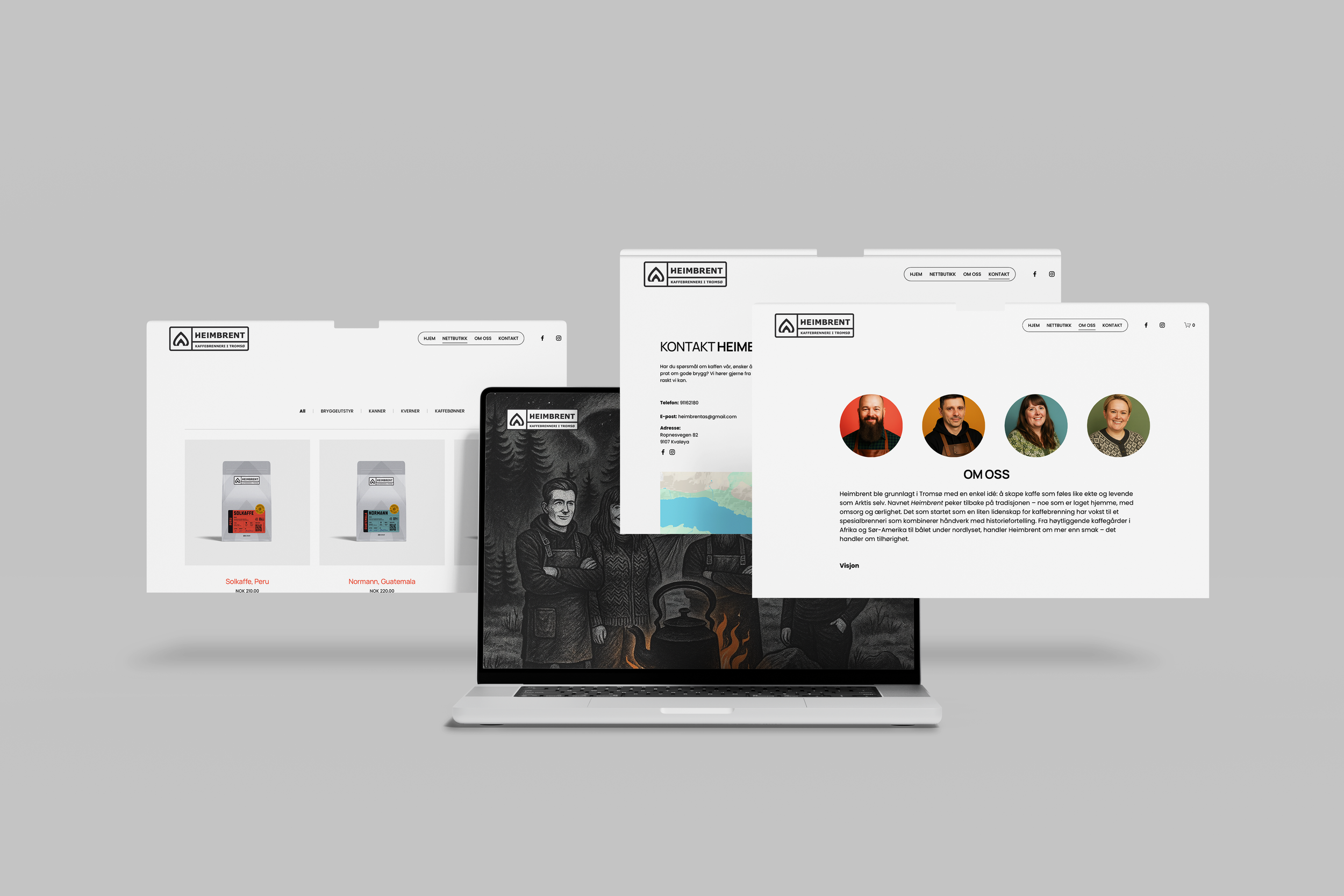
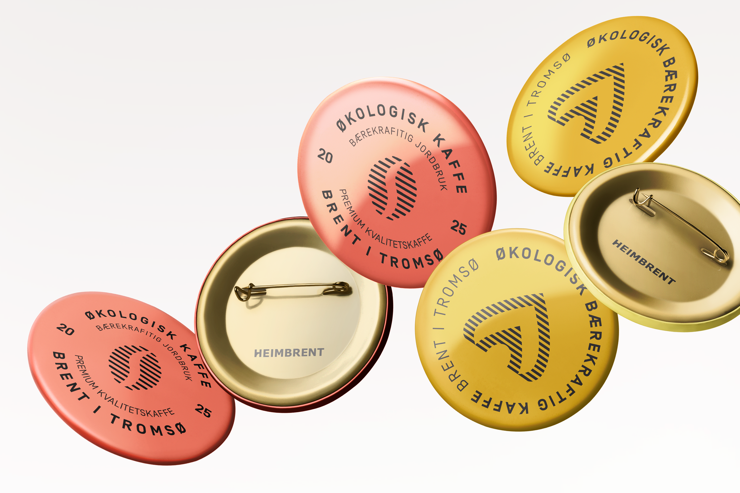
The identity system extends across multiple touchpoints including packaging design, web design, business cards, promotional materials like buttons and stickers, branded merchandise, and even a wooden storefront sign. Throughout all deliverables, I maintained consistency with typography,
the geometric logo pattern, and the brand colours, creating a cohesive brand experience that feels both modern and rooted in tradition.
CLIENT:
Heimbrent AS
DELIVERIES:
Coffee-bags, design
Webdesign
Business cards
Stickers
Presentation video
Caps
Buttons
Sign
Stamp
YEAR:
2025